Columbus Book Festival Redesign
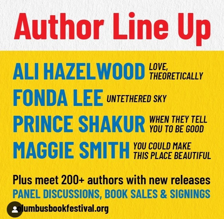
As a self-designated book lover, when I heard that local city Columbus, Ohio was hosting a book festival featuring prominent authors from around the country, I was excited to attend. However, I found that the current branding did not represent or address its target audience.
Design Objective: Rebrand the Columbus Book Festival to better represent the community of book lovers that will be in attendance.
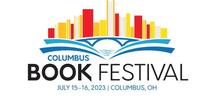
Current Branding
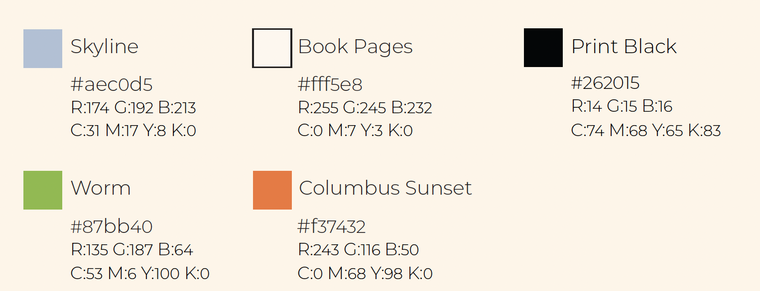
The current branding for the Columbus Book Festival does not truly represent its target audience. The color palette choice seems random, the logo is overwhelming, and I feel there needs to be more emphasis on the book festival aspect, instead of on Columbus as a city itself.
Logo Redesign Process
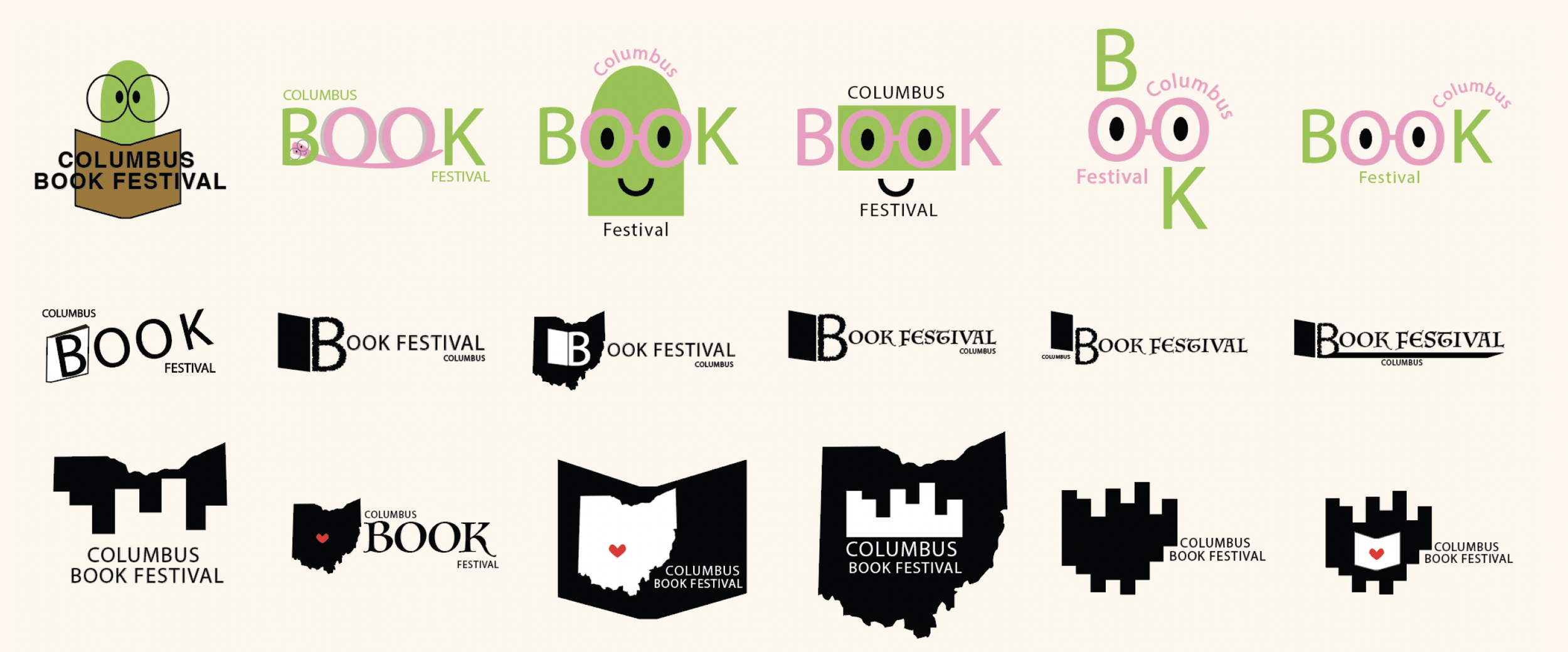
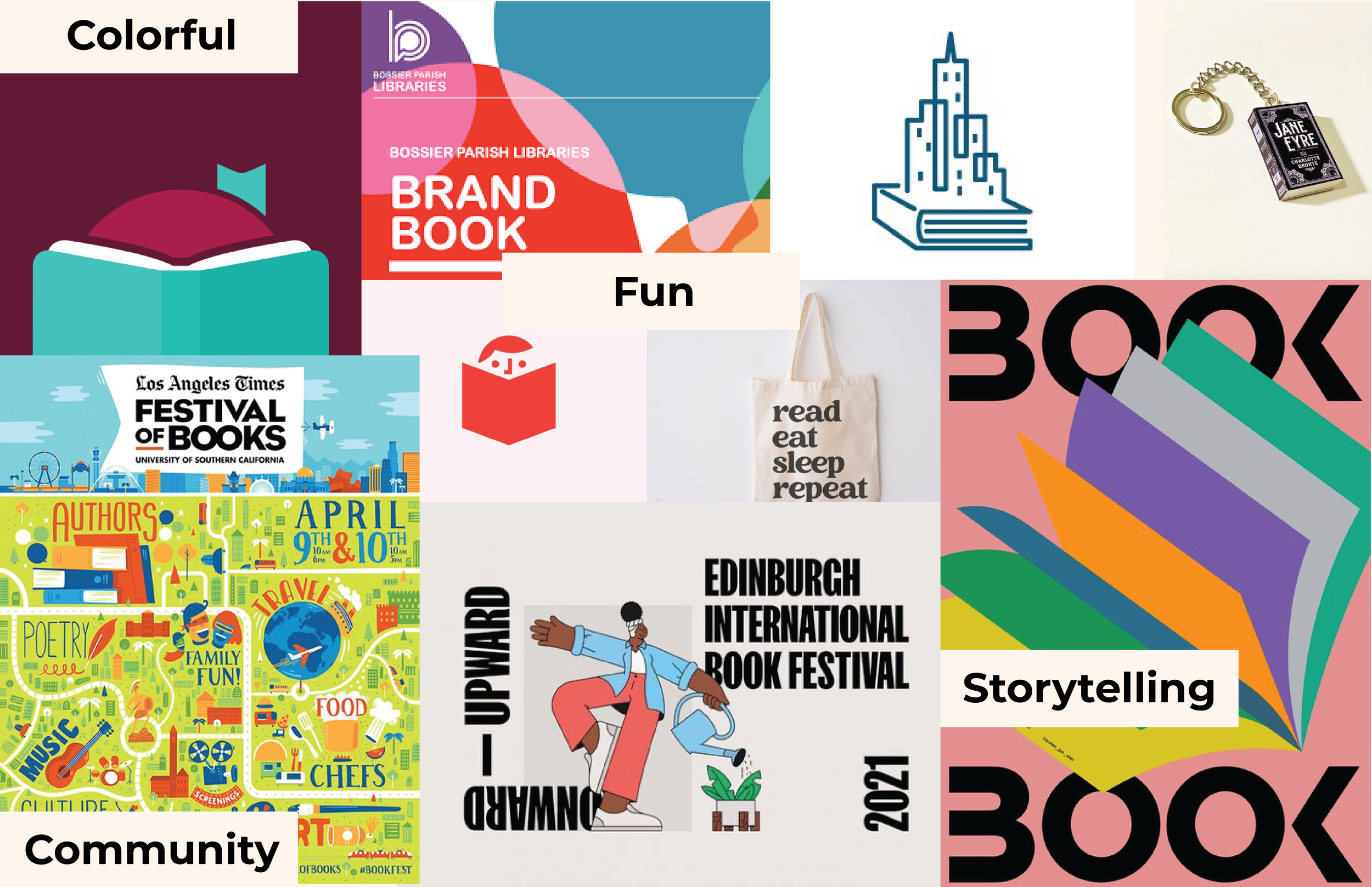
The first step in the redesign process was creating a moodboard to help envision what the new branding should look like, as well as explore references that might inspire the new logo.
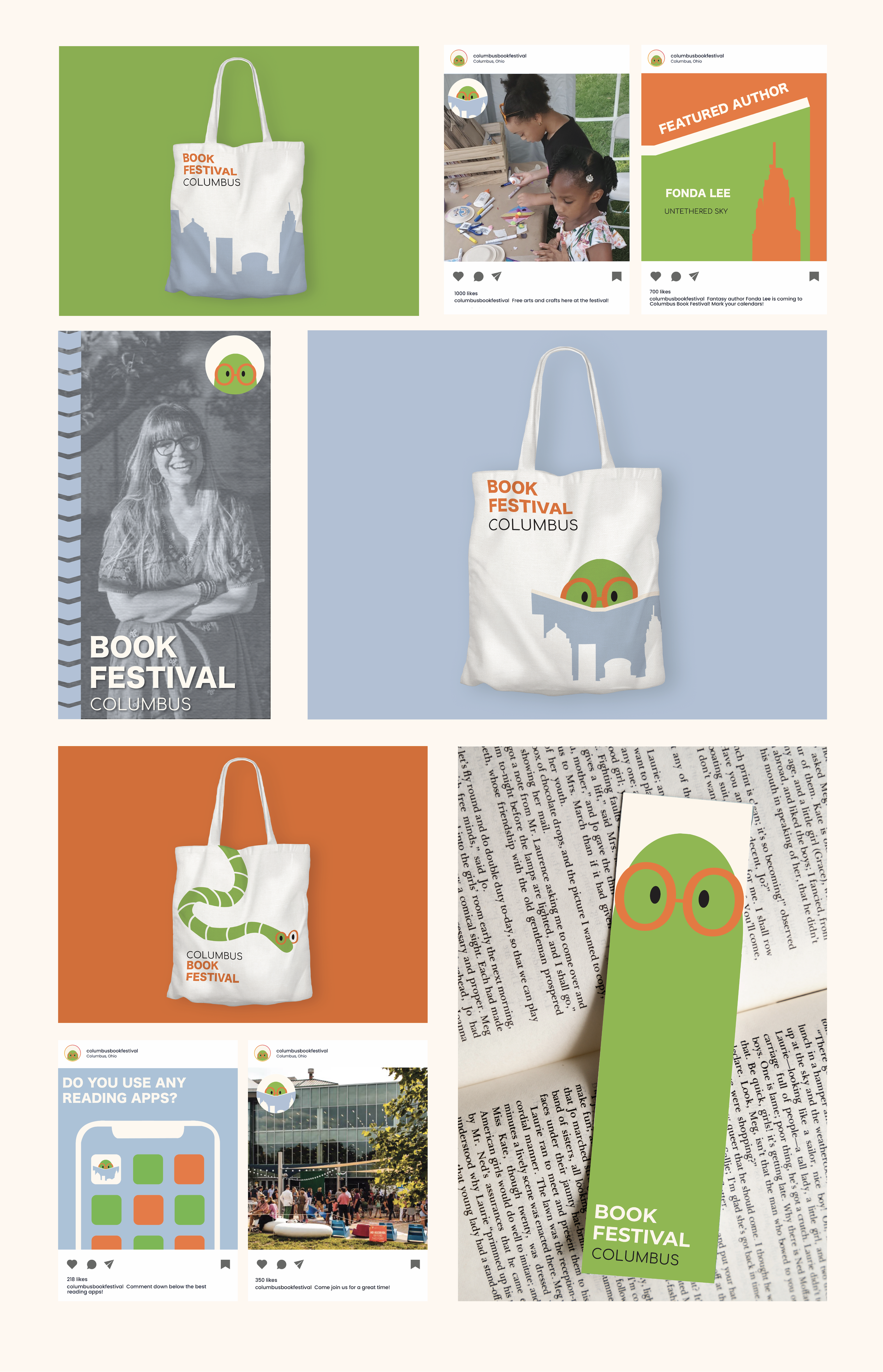
In my exploration sketches I focused on three directions. The first being a worm mascot that is utilized throughout the festival branding, the second being a more type based logo with the B as part of a book, and the third idea which used Ohio to emphasize the community aspect of the festival.
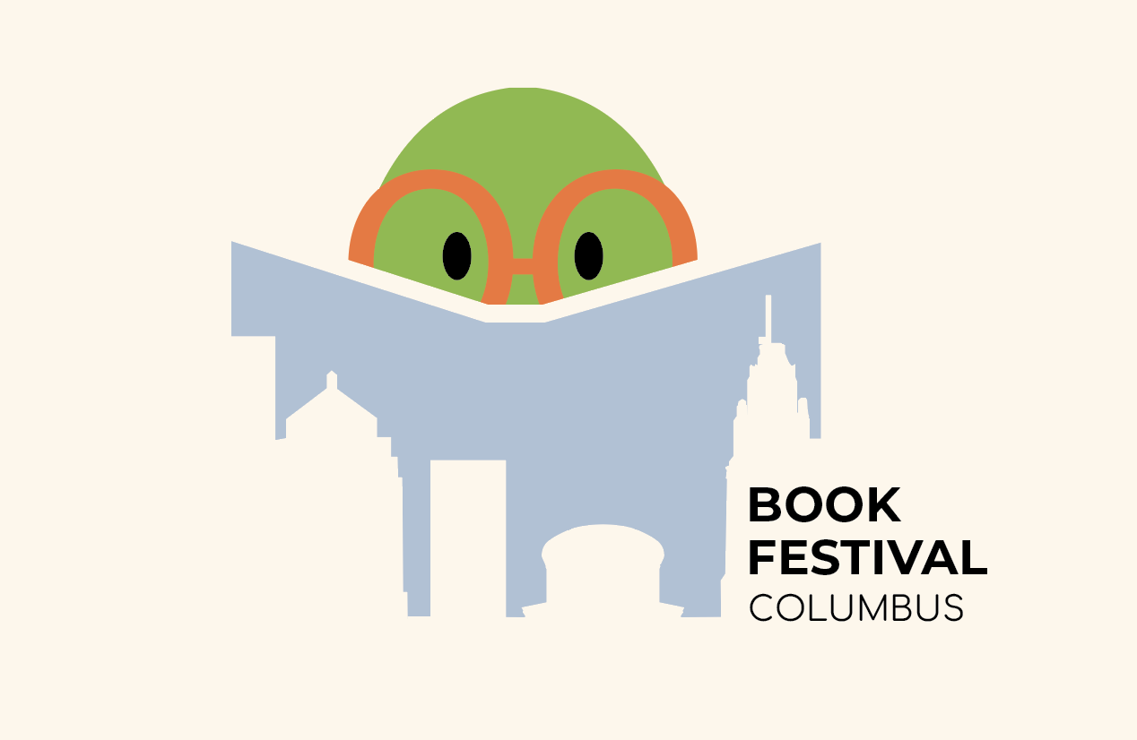
Final Logo

Final Touchpoints