Civic Engagement in East Price Hill
In recent years, there has been a growing disconnect recorded between people and their local government. People often feel unheard and disregarded in the planning process for their communities’ futures. This has sown distrust and frustration into the relationship between residents and their groups of local officials. How might we utilize design to promote trust, transparency, and a stronger relationship between the City and its residents?
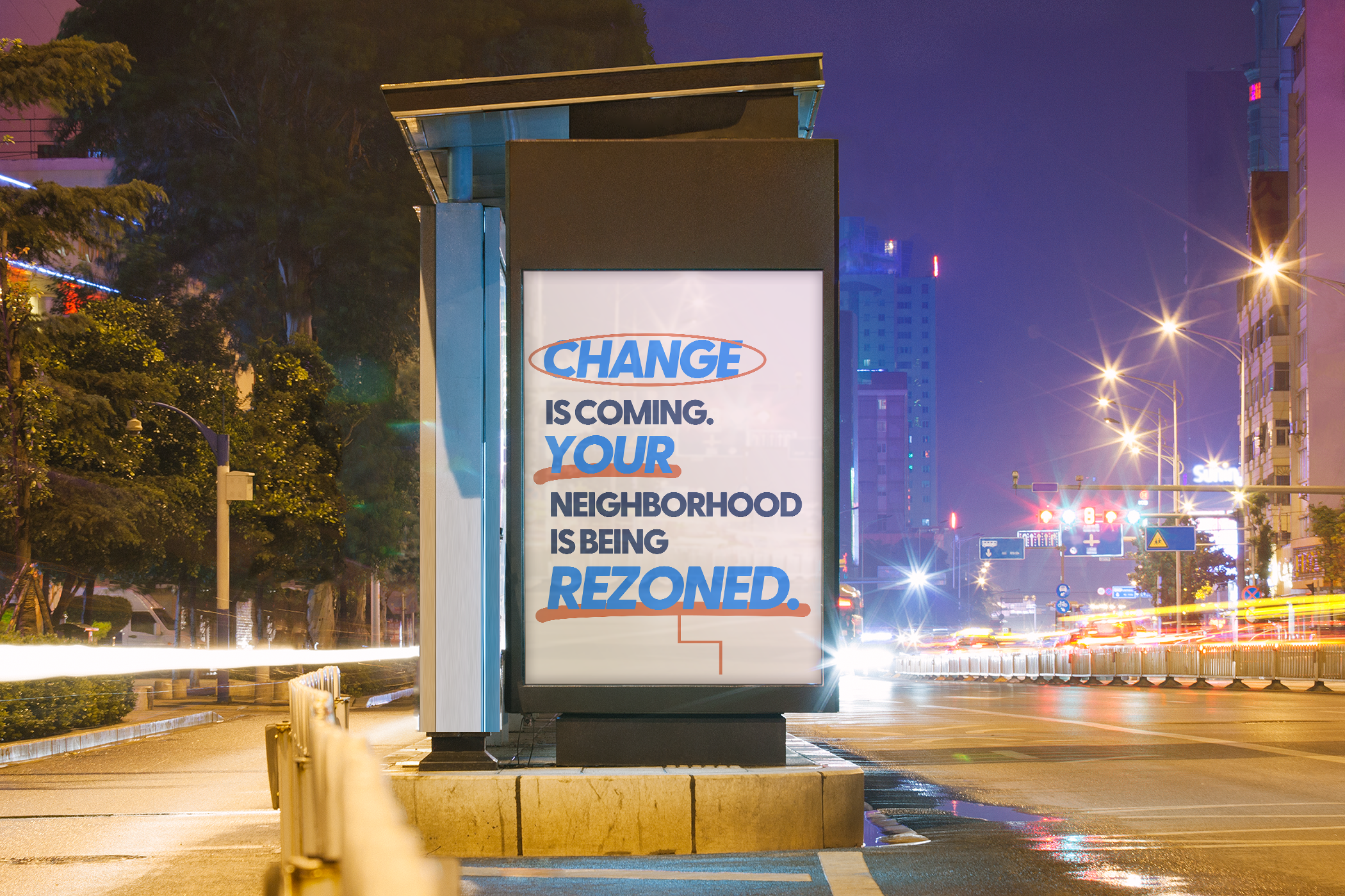
Design Objective: Create an informative pilot campaign involving a new brand identity for the City of Cincinnati that aims to educate East Price Hill community members on the process of rezoning and how to civically engage.
Created in collaboration with Sam Collins and Yuki Hirota
Initial Research
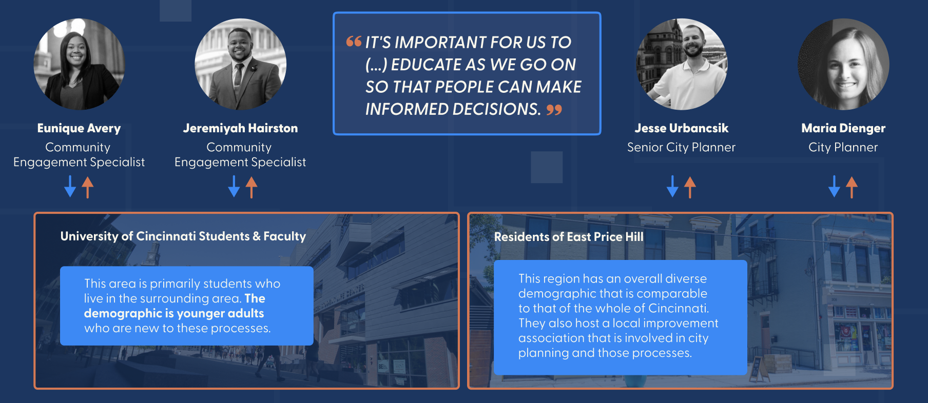
To begin, we met with Cincinnati Community Engagement Specialists as well as City Planners to further understand the process of city engagement, audit their current brand identity, and find what mediums would best serve to provide residents of East Price Hill with the information they need for engage.
Formats
These formats were decided upon because they were able to provide digital and physical interaction points from both home and throughout the community.
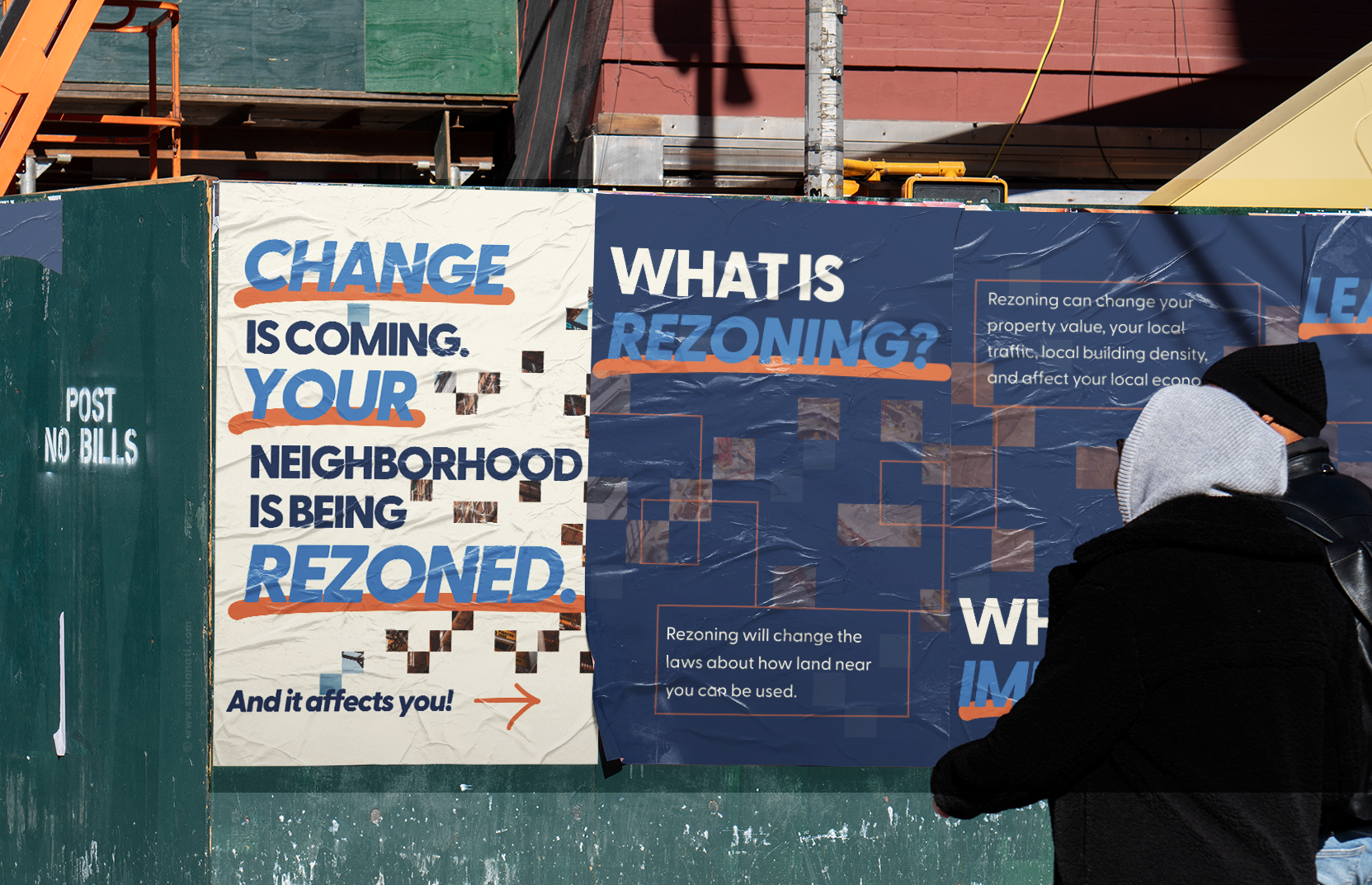
Static Poster Series
Provides Dwell Time
Can be seen Repetitively
Familiar Environment
Animated Video/Poster
Easy to Understand Information
Entertaining
Easily Accessible
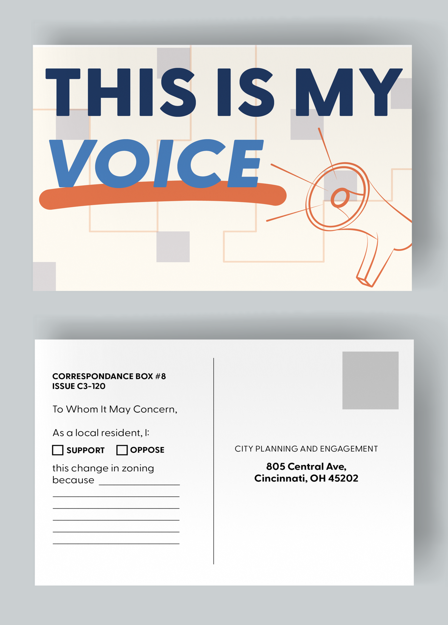
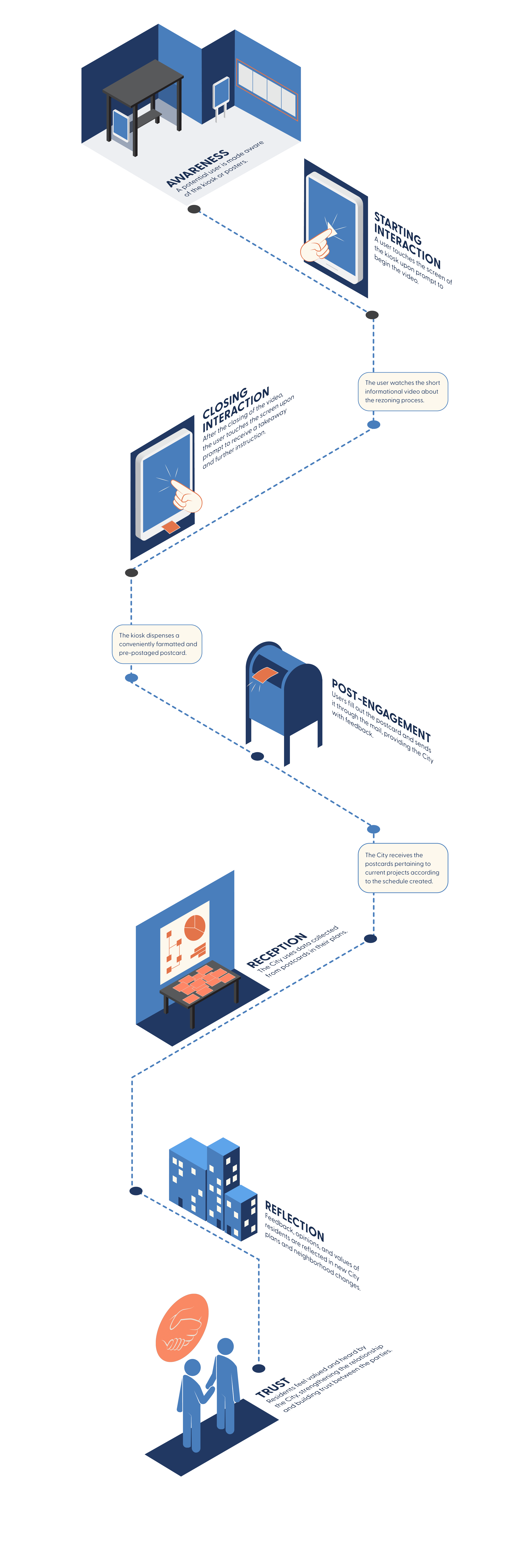
Kiosk/Postcard
Interactive
Actionable
Provides Takeaway/Keepsake
Testing
Through testing, we determined what would be the best design style that encouraged community members to engage with the content. We were looking for our work to be…
Friendly
Credible
Invoke Curiosity
Actionable
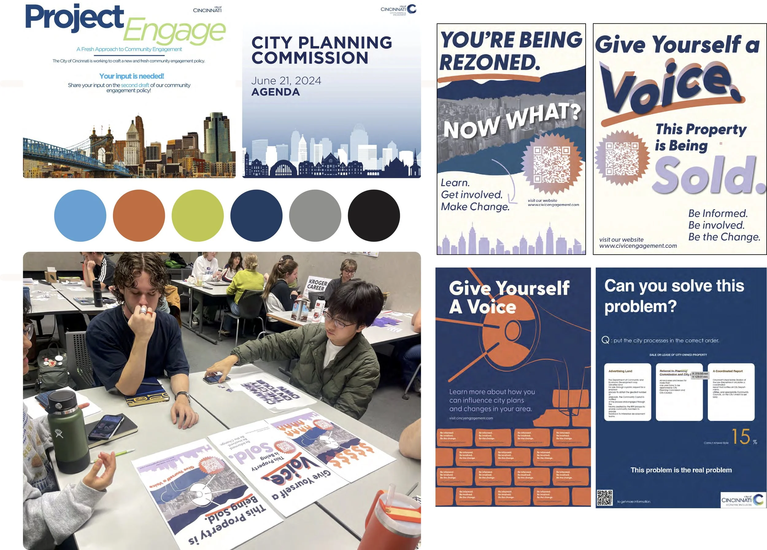
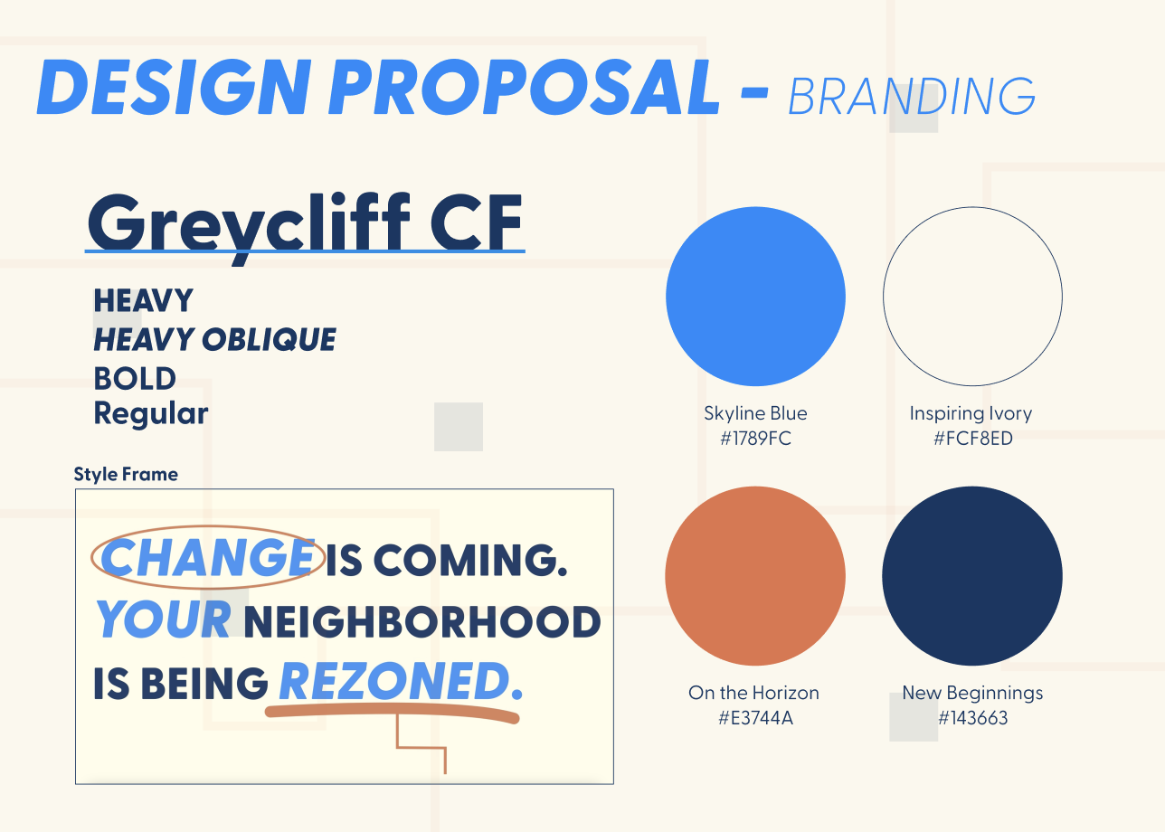
We also tried experimenting with the city’s chosen typefaces and color palette. When working we felt that these aspects of the branding were limiting us when it came to designing something engaging.
We showed participants current City branding examples and asked them to talk about how it made them feel. Most said that it was too institutional, formal, and unrelatable.
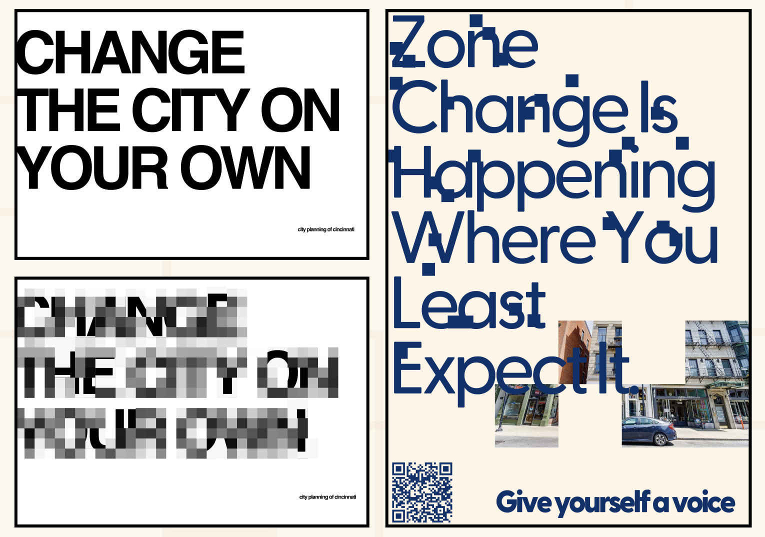
Exploring Themes
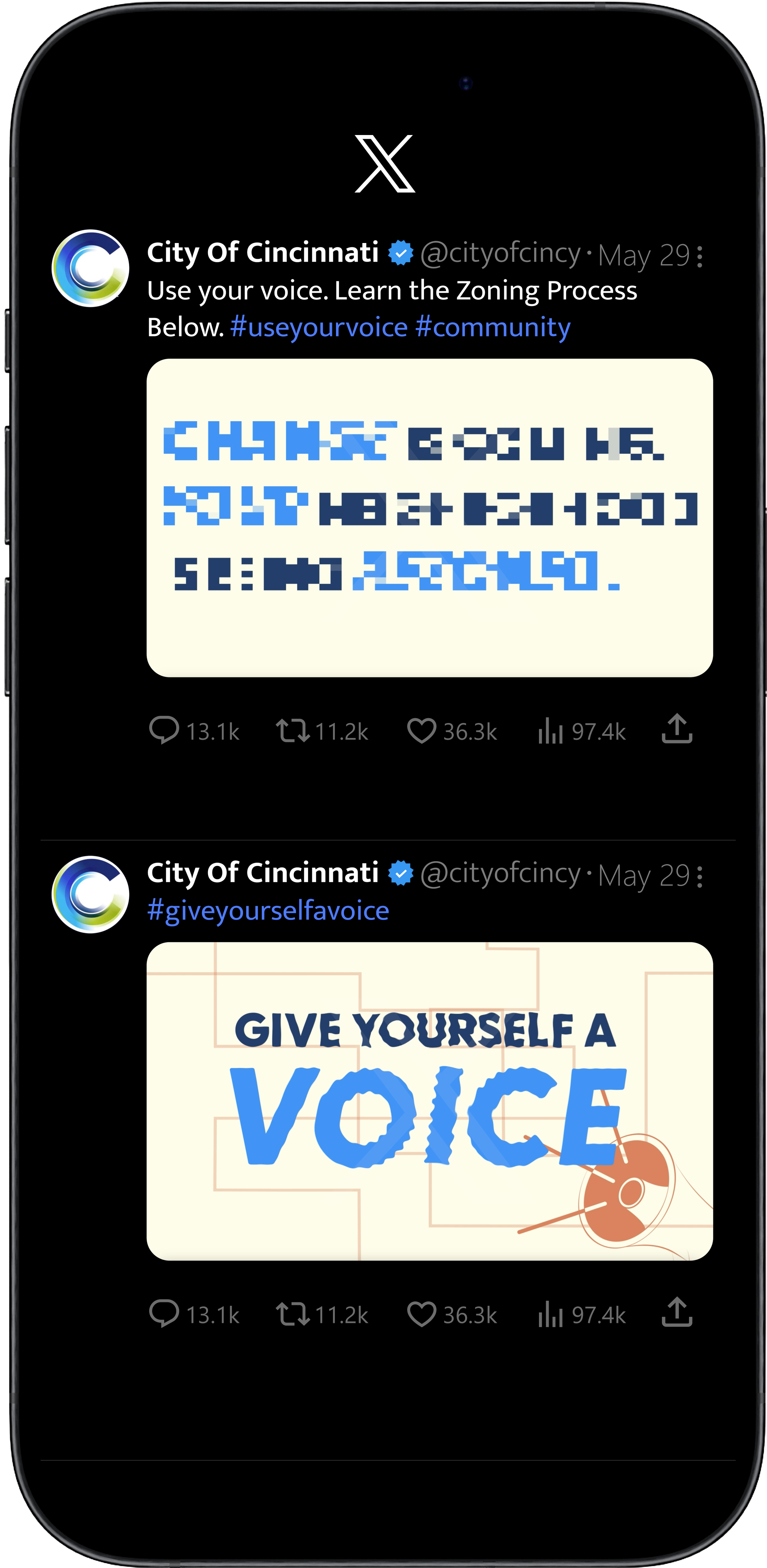
We experimented with the idea of pixelating the text,
and then having a reveal. This idea symbolized transparency and making information within the pilot clearer to the citizens. Our reviewers connected with this idea and felt that it would cause for meaningful engagement.
Final